If you’re familiar with grid systems, you’ll feel right at home. If not, you’ll learn quickly! We adapted the grid based framework Foundation 5 into our themes. Foundation’s columns will allow you to arrange your content depending on your needs inside columns, so you can place your content side by side, in maximum of 6 boxes in a row.
By default, every new row will contain 1 column, and you can increase the amount of columns you wish to lay your content in, by increasing the ‘Columns in Row’ number.
Every column you add inside a row will adjust its width automatically so it fits in one line in your row.
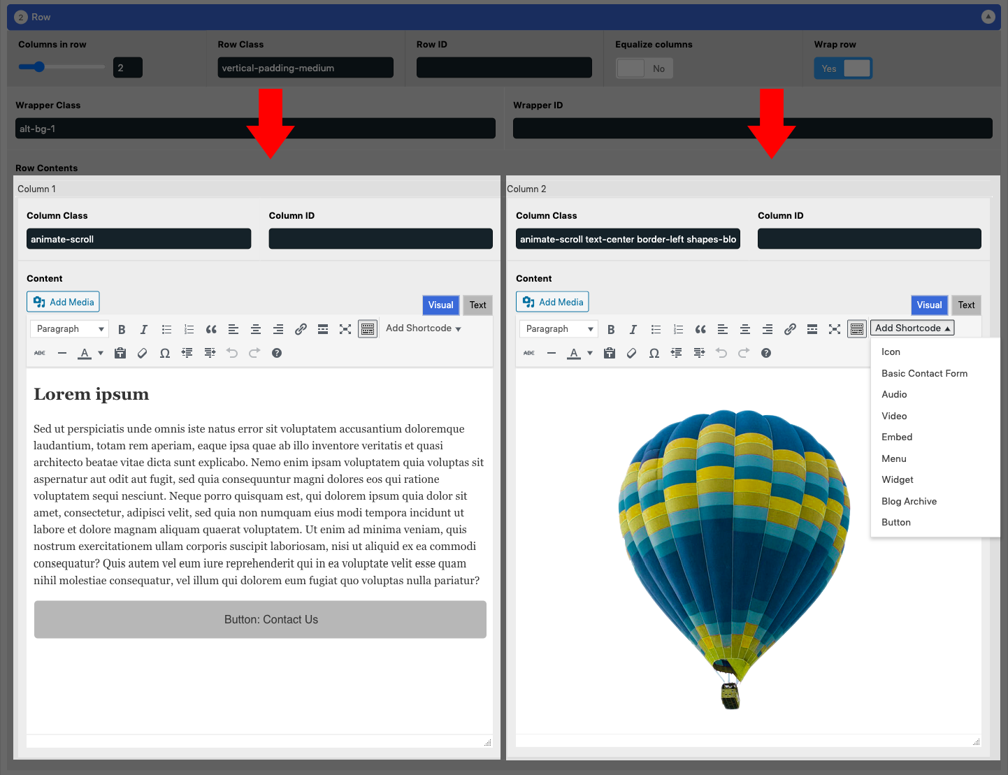
An example of a row with 2 columns:
Changing Column Width
Using only one column inside a row will make the ‘block’ full width across the row. If two columns are set, both columns will be the same width to fit in the same row.
Columns are based on a 12 column grid system. A column with a ‘large-12’ class will take the full width of a row. A column with a ‘large-6’ class will take half of the width of the row.
If you want to override their width to a custom width, you can achieve this by adding specific Foundation 5 grid‘s classes in the Column class field.
Column Options
Each column offers a couple of simple fields and options.
- Column Class
Adds an HTML class to your column for the purpose of CSS styling. You can separate classes with a space. - Column ID
Adds an HTML ID to your column.
The Editor
Each column contains its own editor with tools for content editing, for convenience.
Read more about the content editor here: